Heavy Metal Suspensions
Identity
Maturing a brand with growing responsibilities and ambitions without losing its rockstar soul.
Project Background
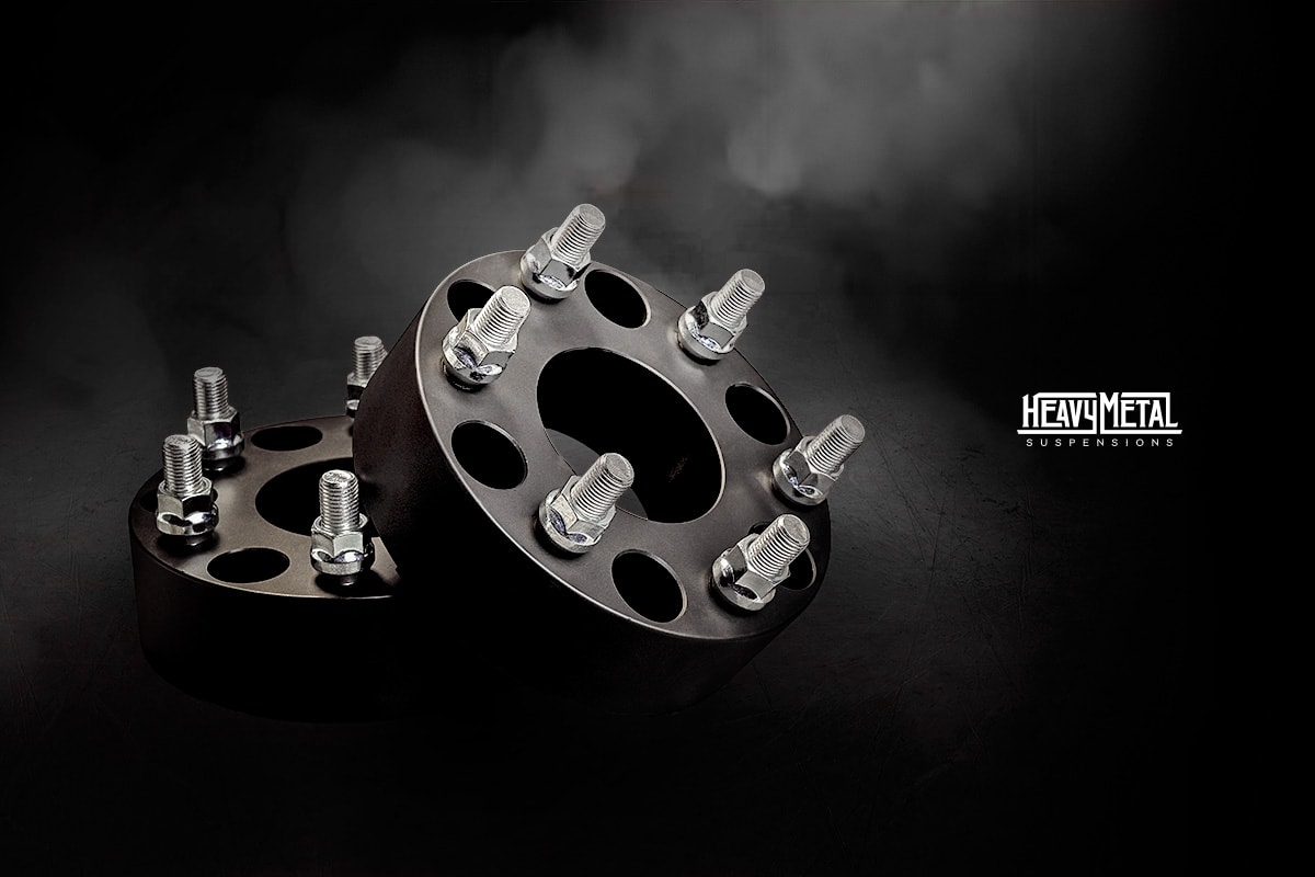
Heavy Metal, a company specializing in all-steel custom auto parts, had a unique concept to convey the dependable strength of steel with the swagger of a rockstar. However, their original brand image heavily relied on 80’s heavy metal imagery which began to feel out of place as the company expanded their offerings. In order to mature the brand and establish themselves as an authority in the steel-made aftermarket auto parts industry, a redesign was commissioned with three goals in mind:
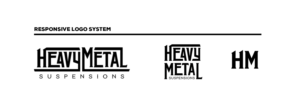
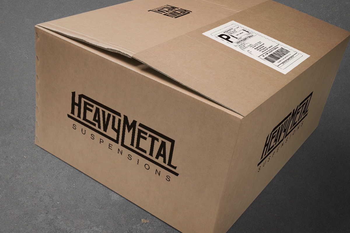
- Create a new logo that could be applied across various mediums.
- Position the company as a trusted expert in the industry.
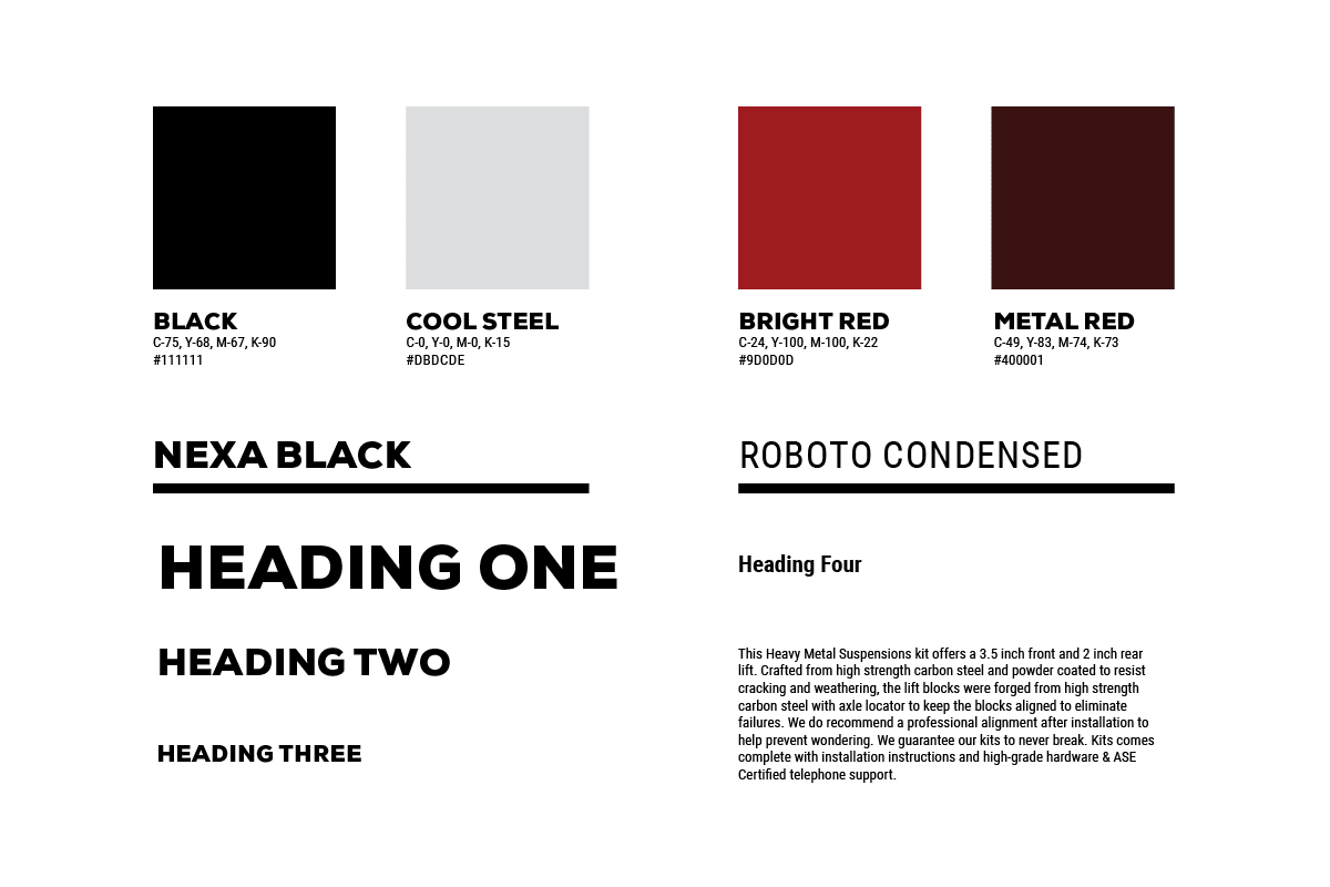
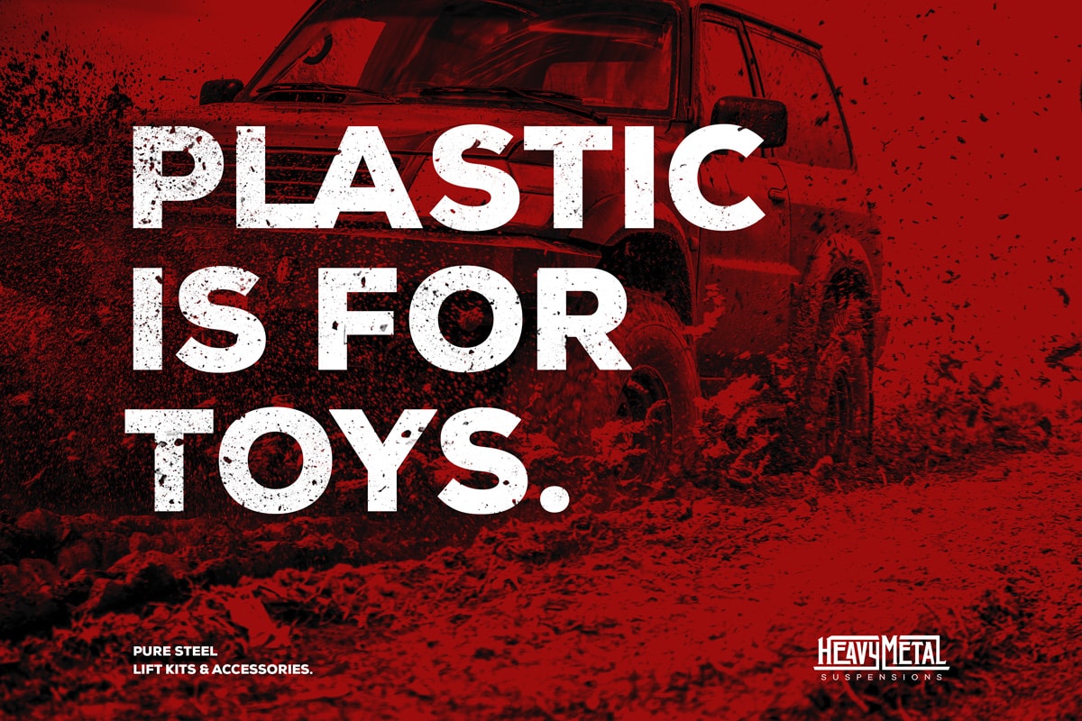
- Preserve the company’s heavy metal identity while appealing to a wider audience.
-
Client
Heavy Metal Suspensions
-
Sector
Automotive
-
Discipline
Identity
